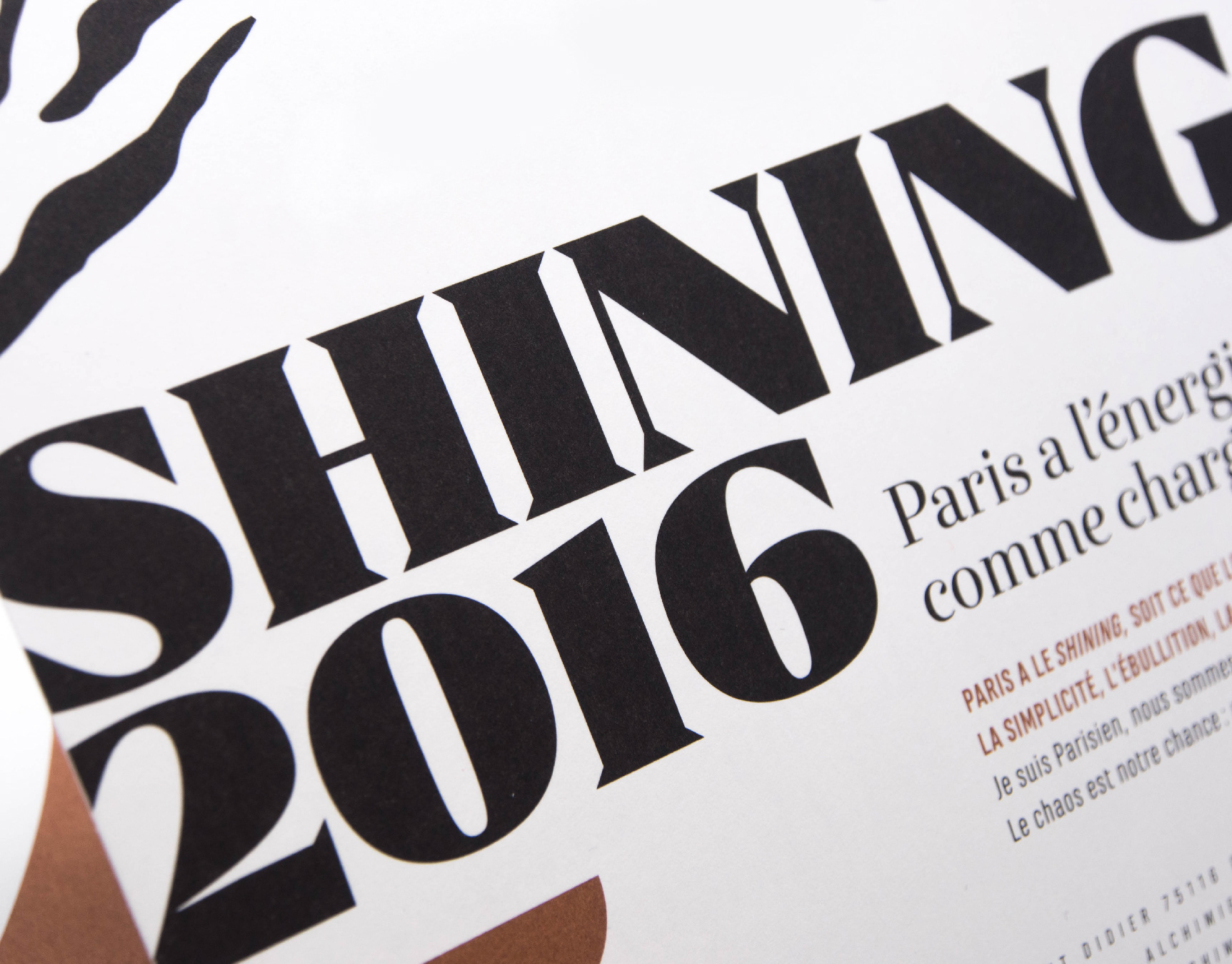
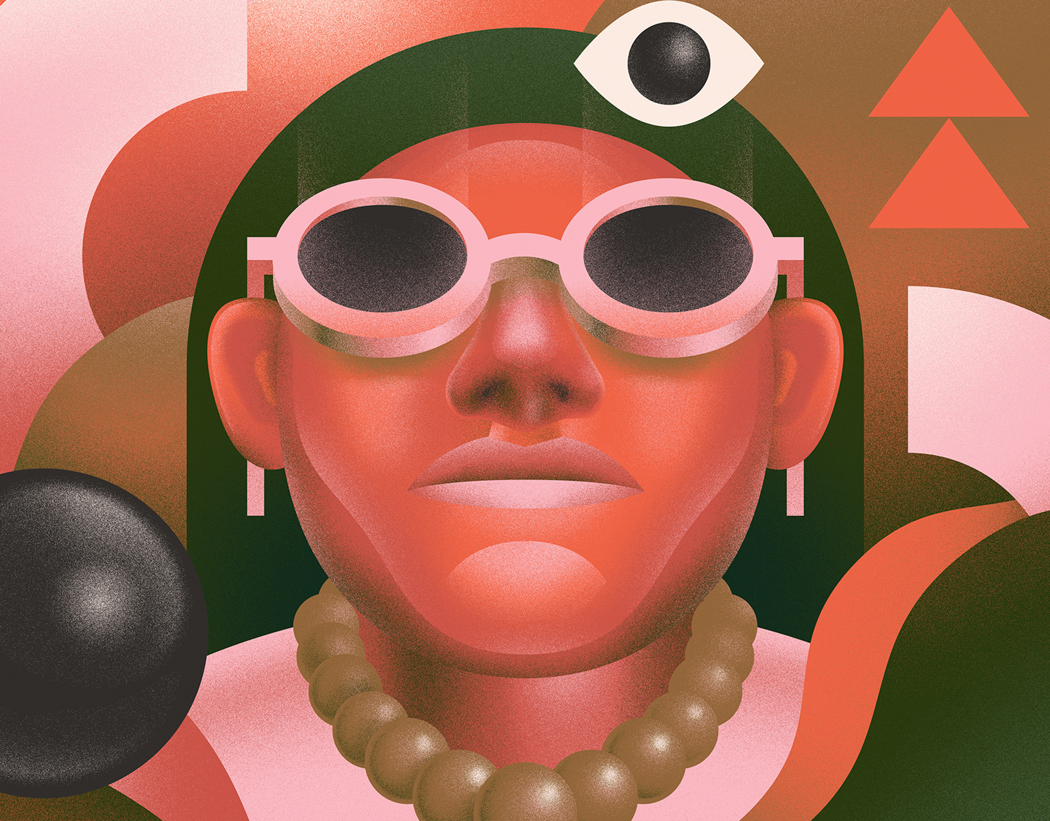
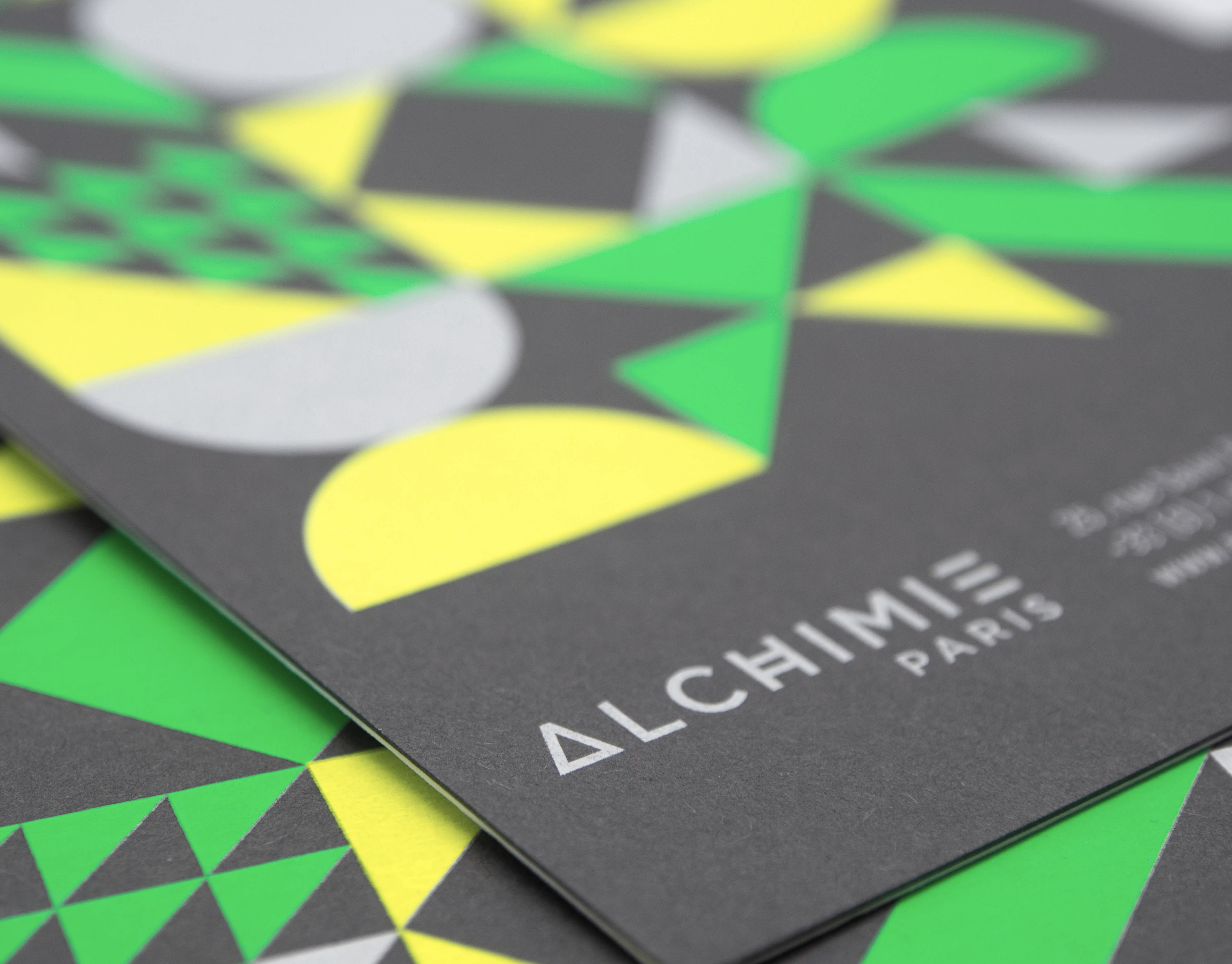
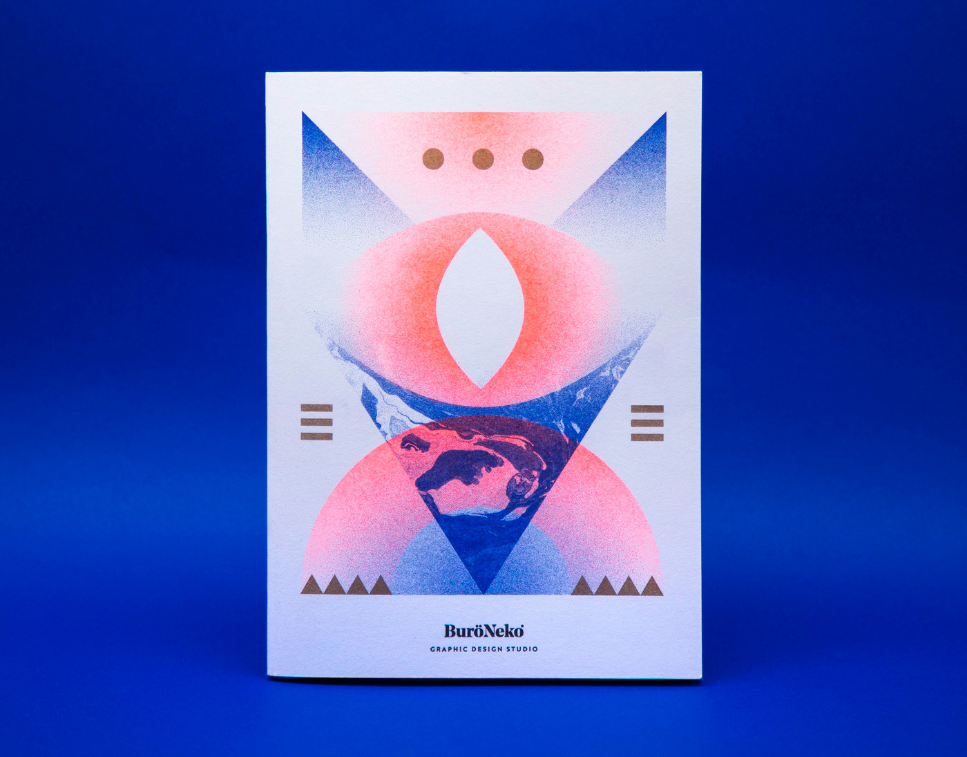
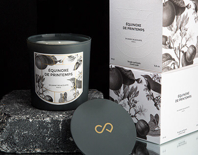
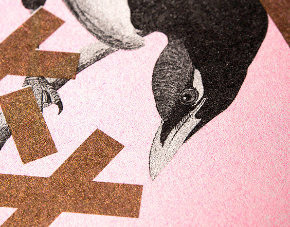
The agency Alchimie has trusted me for many years to build their visual identity and decided this year to reposition its graphic territory. I have developed surrealist black and white collages, a range of golden graphic patterns with touches of Klein blue for more premium and upscale positioning. The printing of the stationery was particularly neat with a hot stamping and debossing on the logo. The website, developed to measure, made it possible to highlight the collages thanks to effects of depth, in parallax.
www.parisalchimie.com
www.parisalchimie.com

